2026 Home Decor Color Matcher
Select a room type and the vibe you want to create to find your ideal 2026 color palette.
Color Name
#000000
Why this works in 2026:
Best Pairings:
You walk into a room and immediately feel something. That feeling? It’s often driven by color. As we move through October 2026, the palette of our homes has shifted away from the stark, sterile whites of the early 2020s. People are craving warmth, depth, and personality. If you’re wondering what color is trending for home decor right now, you’re not alone. The shift isn’t just about picking a new paint swatch; it’s about creating spaces that feel lived-in and grounded.
Here is the quick breakdown of what is dominating interiors this year:
- Warm Neutrals: Creams, beiges, and taupes are replacing cool grays to create cozy, inviting bases.
- Earthy Greens: Sage, olive, and moss bring nature indoors, promoting calm and stability.
- Deep Terracottas: Rich, reddish-browns add warmth and dramatic flair without being overwhelming.
- Sky Blues & Soft Pastels: Gentle blues and lavenders offer a serene escape in bedrooms and bathrooms.
- High-Contrast Accents: Charcoal and black are used sparingly to anchor lighter, warmer palettes.
The Death of Cool Gray and Rise of Warmth
For years, Cool Gray was the default choice for modern homes. It was sleek, safe, and everywhere. But let’s be honest-it could also feel cold and clinical. By 2026, homeowners have collectively decided they want their homes to feel like a hug, not a showroom. This has paved the way for Warm Neutrals. These aren’t your mother’s beige walls. We’re talking about complex shades with undertones of yellow, red, or orange that reflect light beautifully.
Think of brands like Benjamin Moore or Dulux releasing collections focused on "Greige"-a hybrid of gray and beige-but leaning heavily into the beige side. In my own projects here in Melbourne, I’ve seen clients swap out flat white trims for soft cream or even off-white with a hint of butter. Why? Because pure white can look harsh under certain lighting conditions, especially during the long winter evenings. Warm neutrals soften shadows and make rooms feel larger yet more intimate.
If you’re hesitant to commit to a full wall of warm neutral, start small. Swap your throw pillows or curtains. You’ll notice an immediate change in the room's temperature-not physically, but emotionally. It feels cozier. It feels human.
Bringing the Outdoors In with Earthy Greens
Nature isn’t just a theme anymore; it’s a necessity. After the isolation of recent years, people want biophilic design elements. And nothing says "nature" quite like Earthy Greens. These aren’t bright lime greens or artificial mint shades. We are seeing deep, muted tones like sage, olive, forest, and moss.
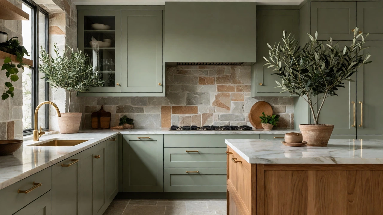
Why do these work so well? Psychologically, green reduces stress. It reminds us of trees, grass, and growth. In a living room, a feature wall painted in a deep olive green paired with wooden furniture creates a sanctuary-like atmosphere. In kitchens, sage green cabinets have replaced the all-white kitchen trend. They hide fingerprints better, feel less sterile, and pair beautifully with brass hardware.
Consider using green in unexpected places. Paint the inside of a bookshelf. Use a moss-green rug in a bedroom. Even houseplants themselves act as living decor elements that complement these wall colors. The key is saturation control. Go for dusty, desaturated greens rather than vibrant ones. Vibrant greens can feel chaotic; dusty greens feel settled.
Terracotta and Clay: The New Bold Choice
If you want drama without going too dark, look at Terracotta. Inspired by Mediterranean architecture and desert landscapes, this reddish-brown hue has exploded in popularity. It’s warm, tactile, and incredibly grounding.
Terracotta works best in spaces where you want to encourage conversation or relaxation. Dining rooms and reading nooks benefit from this shade because it stimulates appetite and comfort. Unlike red, which can feel aggressive, terracotta is muted by its clay-based undertones. It pairs exceptionally well with natural materials like rattan, linen, and unpolished stone.
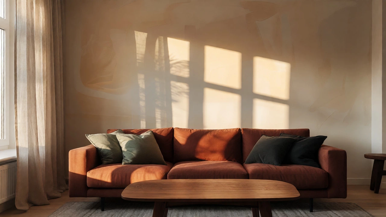
One common mistake? Using terracotta as a dominant color in a small, poorly lit room. It can shrink the space visually. Instead, use it as an accent color. A terracotta sofa against a cream wall, or terracotta tiles in a bathroom entryway, adds character without closing in the room. If you live in a sun-drenched area like parts of Australia, you might get away with larger blocks of color, but always test samples at different times of day first.
Soft Pastels and Sky Blues for Serenity
While warm tones dominate, there’s still a strong desire for calmness. Enter Soft Pastels, specifically sky blue, lavender, and pale peach. These colors aren’t the bubblegum pinks of childhood; they are sophisticated, airy, and ethereal.
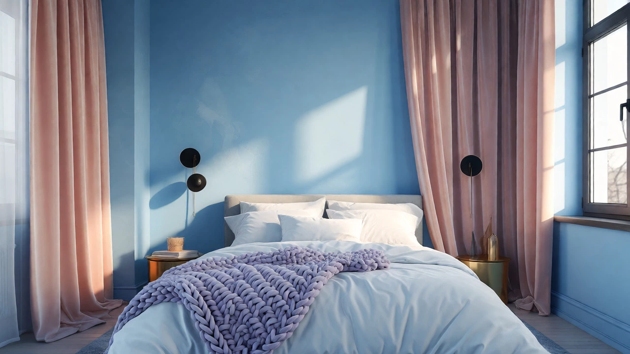
Sky blue, in particular, has made a comeback. But it’s not the navy blue of traditional nautical themes. It’s a lighter, cloud-like blue that mimics the horizon. This color is perfect for bedrooms and bathrooms where you want to lower your heart rate before sleep. Lavender offers a similar effect but with a touch of luxury. Pale peach brings warmth without the intensity of orange, making it ideal for nurseries or guest rooms.
How do you keep pastels from looking childish? Texture. Pair a pale blue wall with heavy velvet drapes or a chunky knit throw. The contrast between the light color and heavy texture keeps the room feeling adult and substantial. Also, mix pastels with metallics. Gold accents elevate a pastel pink room instantly.
Using Dark Accents for Contrast
A palette needs anchors. Without them, everything floats. This is where Charcoal and Black come into play. These aren’t the main event, but they provide the necessary contrast to make warm neutrals and pastels pop.
Think of black window frames, charcoal cabinet handles, or black light fixtures. These elements frame the view and define the space. In 2026, matte finishes are preferred over glossy ones. Matte black looks softer and more integrated into the design, whereas gloss can feel dated or industrial depending on the context.
Don’t underestimate the power of wood tones either. While technically not a "color," rich walnut or oak acts as a neutral anchor that bridges the gap between warm walls and dark accents. Mixing wood tones is acceptable now-just ensure they share a similar undertone (e.g., both warm or both cool) to avoid clashing.
How to Choose Your Trending Color
Choosing a color isn’t just about following trends; it’s about how the light hits your specific space. Here is a simple checklist to help you decide:
- Assess Natural Light: North-facing rooms need warm colors to counteract cool light. South-facing rooms can handle cooler tones if desired, though warm neutrals still work beautifully.
- Test Samples Large: Buy peel-and-stick sample pots. Paint a large square on multiple walls. Watch it at morning, noon, and night.
- Consider Existing Furniture: If you have a brown leather sofa, avoid cool grays. Stick to warm creams or greens.
- Define the Room’s Purpose: Energize with terracotta in social areas. Calm with sage or blue in restful areas.
- Mix Textures: Color is only half the battle. Combine smooth, rough, soft, and hard surfaces to give depth to your chosen palette.
| Color Family | Best For | Vibe | Pairs Well With |
|---|---|---|---|
| Warm Neutrals | Living Rooms, Hallways | Cozy, Inviting | Wood, Brass, Linen |
| Earthy Greens | Kitchens, Studies | Calm, Grounded | Rattan, Stone, Plants |
| Terracotta | Dining Rooms, Nooks | Warm, Dramatic | Cream, Black, Clay |
| Sky Blue/Pastels | Bedrooms, Bathrooms | Serene, Airy | White, Gold, Marble |
| Charcoal/Black | Accents, Fixtures | Modern, Sharp | All Trending Colors |
Frequently Asked Questions
Is gray completely out of style for 2026?
Not entirely, but cool, sterile grays are definitely declining. However, "greige" (gray-beige) remains popular because it offers the neutrality of gray with the warmth of beige. If you love gray, choose one with warm undertones rather than blue or purple undertones.
What is the most popular color for kitchens in 2026?
Sage green and deep navy are top contenders for kitchen cabinets. White is still present but often paired with colored islands or backsplashes. Warm woods and terracotta accents are also very common in kitchen designs this year.
How do I introduce trending colors without repainting?
Start with textiles. Throw pillows, rugs, curtains, and bedding are easy ways to test colors like terracotta or sage. Artwork and decorative objects like vases or lamps can also introduce these hues without commitment.
Do these trends work for small apartments?
Yes, but use caution with darker shades. Warm neutrals and soft pastels expand small spaces. If you want to use earthy greens or terracotta, limit them to one accent wall or accessories to prevent the room from feeling cramped.
What finish should I use for trending wall colors?
Matte and eggshell finishes are currently favored for their ability to hide imperfections and provide a soft, velvety look. Satin is practical for high-traffic areas like hallways and kids' rooms, while gloss is generally reserved for trim and doors.
Final Thoughts on Your Color Journey
Trends come and go, but your home should reflect who you are. The shift toward warm, earthy, and grounded colors in 2026 suggests we are collectively seeking comfort and connection. Whether you choose a creamy base, a sage green accent, or a bold terracotta statement, ensure the color makes you feel good when you walk through the door. Don’t chase the trend blindly; adapt it to your light, your lifestyle, and your taste. That’s how you create a home that stays stylish long after the next trend cycle begins.